Mixpanel
JayJo
"Don't always give users what they ask for."
This quote was continually pushed on us as product designers when evaluating and researching what we were going to build next.
It didn't mean we weren't supposed to listen to our customers. In fact, it meant quite the opposite. It was our leader's way of getting us to think outside the box, to really dig in and question the why behind our customers' asks.
So that's exactly what I did when it came to redesigning Email Digests. I sought out the QBQ, or question behind the question.
Project Deets
- Year — 2015
- Role — Design Lead
- Skills — UI / UX / Proto
Product Goals
- Increase clarity to user
- Boost user engagement
- Update visual design
Where we started...
Time to talk with some customers.
My research for this project consisted of collaborating with the support and sales team to gather as much customer information that I could, whether those were current customers or customers that we had churned or we hadn't closed.
I compiled all of that data and found the most common themes (feature requests, complaints, product gaps, etc.). I surveyed several of Email Digest power users and began reaching out and interviewing those who we were willing to let me dive in a little deeper.
The vast majority of customers wanted three things:
Support for other products
Better frequency options
More flexible nomenclature
Email digests only supported Trends, one of Mixpanel's older, less-powerful reports.
Digests could only be sent out daily, weekly, or monthly.
Name of the digest inherited whatever name the user gave it when they bookmarked it.
When asked what they loved most about Email Digests, the answer was almost always something to the effect of:
"I love being able to roll over before I get out of bed and look through my alerts."
Bam. Boom. BINGO.
While the customers asked for better Email Digests with more flexibility, what they really wanted was the ability to look at their data whenever, and wherever they were.
Let's give 'em a mobile app.
Up to that point Mixpanel hadn't built a mobile app. The thought of Mixpanel queries with potentially thousands of permutations working effectively on a mobile device seemed silly.
But, Digests typically consisted of teams' and companies' KPIs — there wasn't a need to dig deep into the data for this mobile app use case.
Wireframes FTW.
We knew the idea of scrapping Email Digests altogether was going to be a hard sell, so I collaborated with the engineering lead to establish what we felt was a good V1 to pitch to the PM.
The result was the following application flows.
After some pushing for what the customer data showed was right, we won our fearless leader over, and he was ecstatic. We finally had a reason to lay the foundation for MP-mobile, however he felt it could ultimatley be simplified.
We rushed out of the conference room and immediately got to work iterating, getting the wireframes in front of the customers we'd initially interviewed to get their thoughts, and to see where and if they'd have troubles.
After multiple design sessions, critiques, and usability tests, we landed at the flows below, ultimately shedding a couple steps in the report creation flow, removing a report view, and adding a summary, dashboard-like screen.
The bar for visual design is high at Mixpanel.
We were in the midst of the initial stages of a complete visual overhaul for Mixpanel. We started with the marketing site, but hadn't touched the product yet.
So as a design team, we decided to explore some new visual directions for Mixpanel's product, figuring the mobile app could be a great introduction of the new interface patterns.
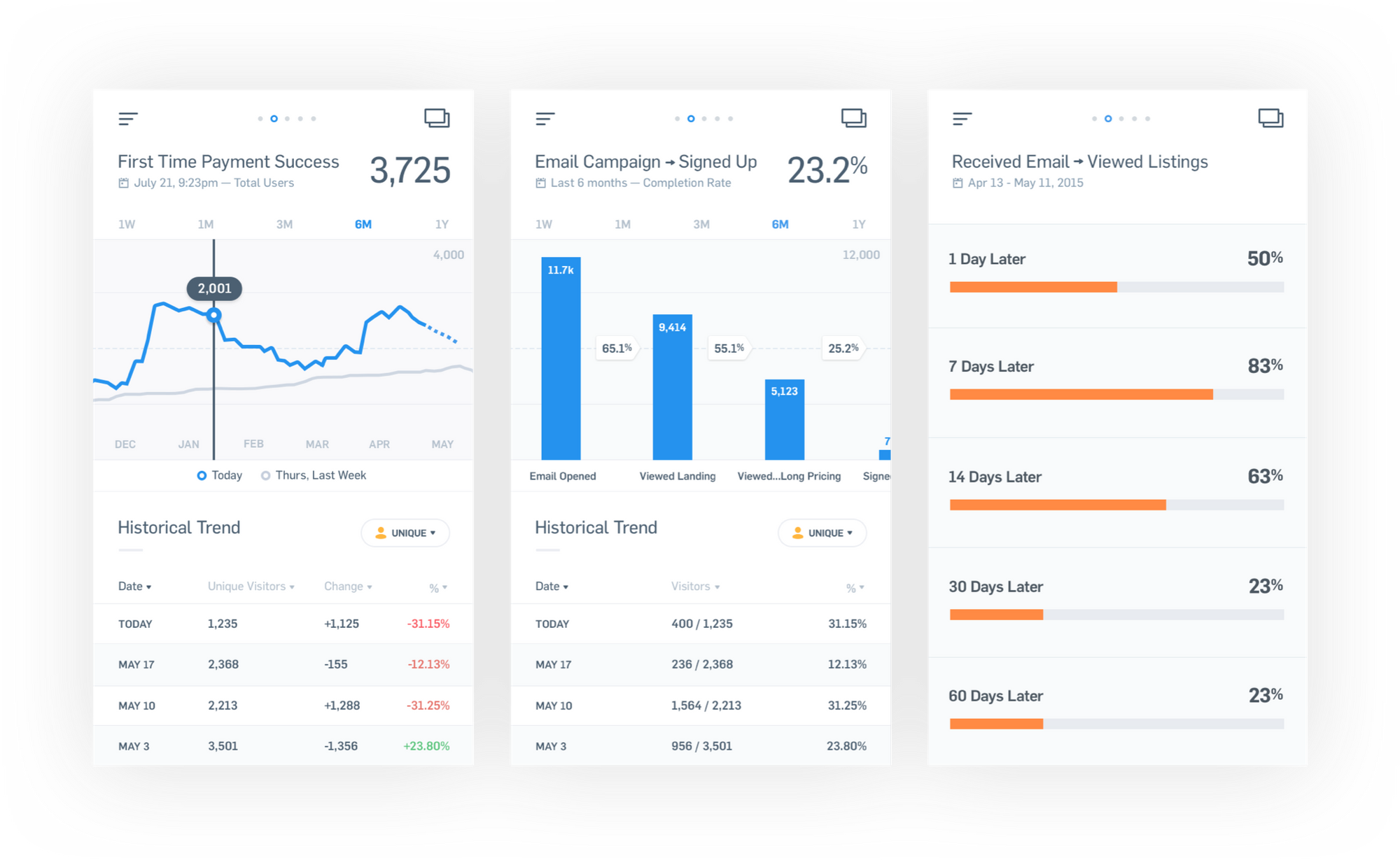
We eventually settled on the application views below, merging our clean, focused UI for reports and analytics, and our new gradient theme for things like onboarding and supporting views.
Product performance and success:
6
Number of weeks to design, build, and ship. (2 weeks longer than original timeline for Email Digests.)
72
Percent retention rate for users who downloaded the app and created a report.
4.8
Star rating in the Apple iOS App Store to this day.
"Jeff is incredibly easy to work with in that he is a responsive listener that balances his own opinion and peoples' feedback. I respect how much he works to be technical and code literate in a org that doesn't require it. He leads the team in culture and general creativity. I have yet to work with a designer that is as well-rounded, both professionally and personally."- Engineering Colleague, 2016
Things I would do differently
I would speak with more executives and broaden the userbase/usertype we interviewed.
After launch, we learned people lower in the organization would often forward KPIs onto higher-level colleagues who weren’t regular Mixpanel users. Mixpanel mobile didn’t afford them the ability to do this, and thus we had to re-enable the Digests feature for ~20 companies.
Two years later we eventually redesigned and rebuilt Email Digests making them move robust and powerful.
